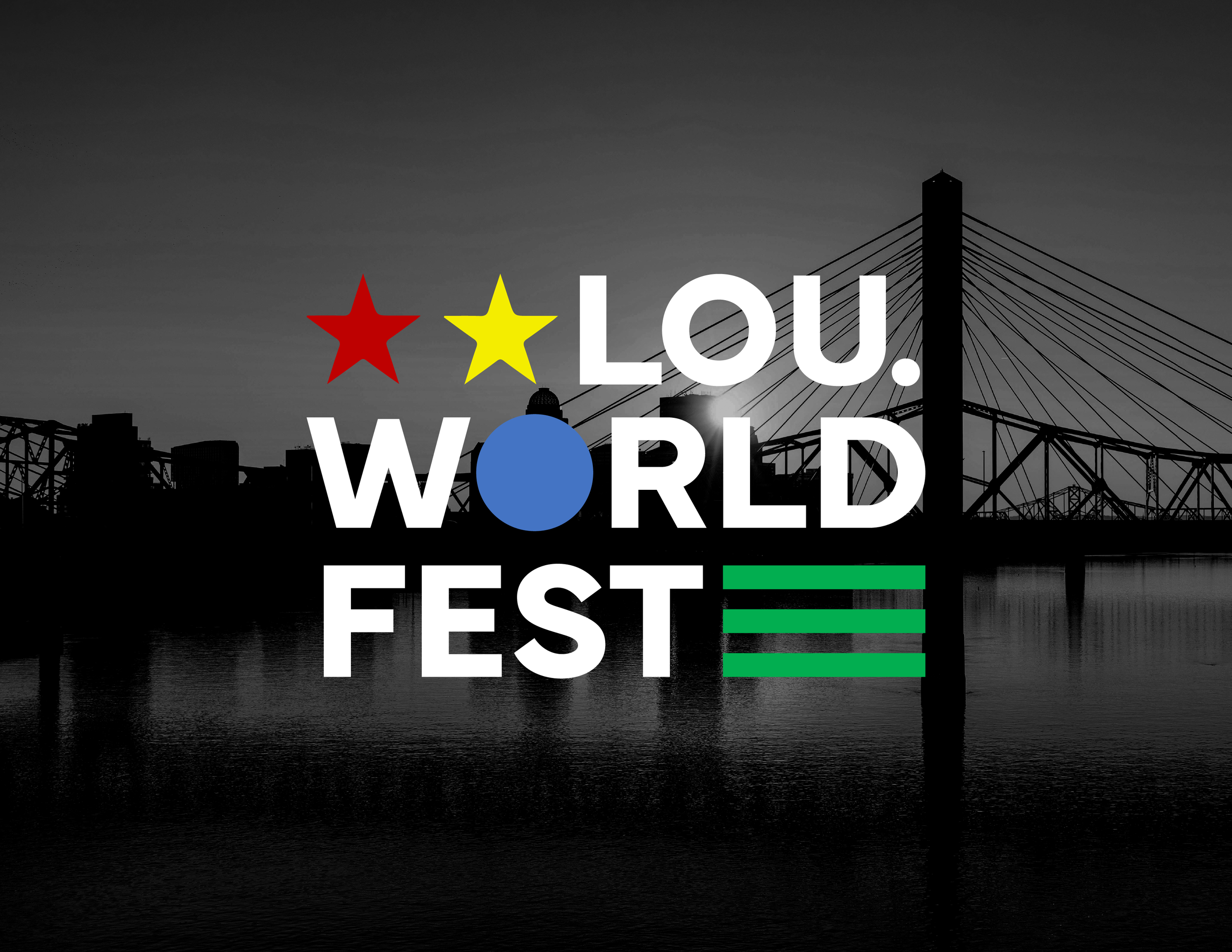
Louisville WorldFest Visual Identity
WorldFest is an existing festival that celebrates and showcases the international cultures and communities that make up the city of Louisville and neighboring areas. Looking into the festival’s current branding, I set out to redesign the visual system to encompass the diversity in which it is celebrating.
Sketches
With the final visual system intending to be modern and abstract concept designs had an emphasis on bold sans serif type paired with geometric shapes to represent significant flag like attributes.
Logo
Translation of logo from sketches to digital was successful and the brand started to build itself. Research of flag design resulted in the selection of colors and shapes that are most common across the world. The intent behind this decision was to make the branding as inclusive as can be.


