Ohio Expo Center Iconography
Working at Populous, I designed a system of neighborhood icons for all directional pylon signs across the Ohio Expo Center Campus. With the campus being broken into eight neighborhoods, I was tasked with designing an icon for each to then be incorporated into their new wayfinding system.
Neighborhood Research
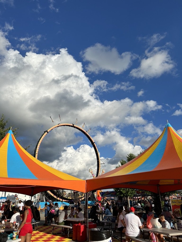
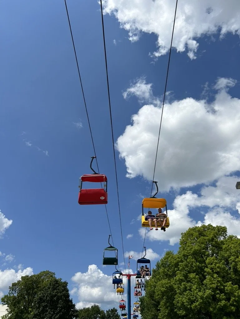
First step in the design process was researching the campus to gain an understanding of what makes each neighborhood unique. Findings were used to establish an identifiable symbol or landmark found within that best depicts each specific neighborhood.
Landmark Imagery
Going through the Imagery of the campus that Populous collected while on site, concepts began forming for each neighborhood. Began experimenting with different landmark locations for each neighborhood, trying to avoid choosing subjects that looked too similar to one another and could be easily distinguished.
Digital Iteration
Design rules were set up before designing the icons to ensure they worked as a system. Each neighborhood icon has a specific color from a well-known place in the park and each represents a neighborhood's landmark. Different neighborhoods faced unique design challenges – for example, Ohio Promenade I struggled with adding dimension while trying to remain simplified. In Natural Resource Park and Town Square the landmarks chosen, switched halfway through iterations.
Ohio Promenade
Livestock Showcase
Natural Resources Park
Town Square
Final Icon Set
Pylon Application
After rounds of iteration and selecting the final icon for each neighborhood, the final step in the design process was to see how the icons looked applied to the pylons themselves.


