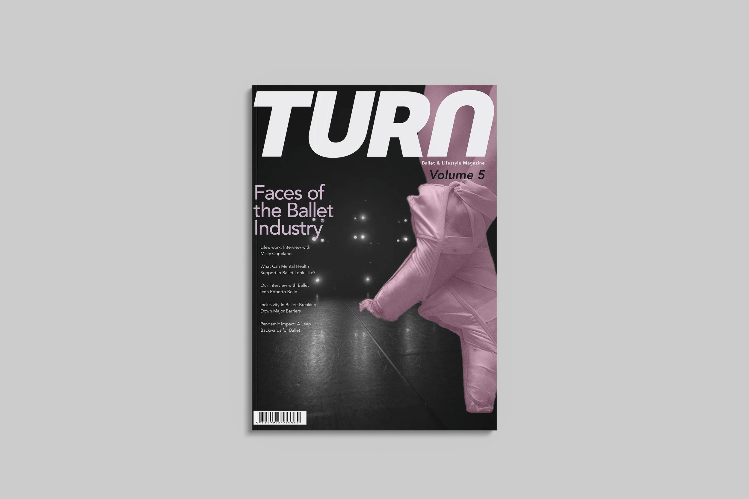
Turn Magazine Publication
TURN is a sports and lifestyle publication that provides readers with insight into the lives, success stories, and struggles of the faces within the Ballet Industry. The goal of this project was to develop a wordmark that typographically communicates the meaning behind the magazine and to create a visual identity implemented throughout each of the spreads.
Magazine Wordmark
Objective: For my magazine publication Turn, I developed a word mark identity that exemplifies the definite culture of the ballet industry while communicating a typographic contrast of movement through a visual typeface.
Magazine Conceptualization
Concept Brief: Striving to illuminate the Ballet Industry. Interview articles reveal dancers' perspectives, success stories, mental health battles, and career timelines. Uncover the art, shared experiences, and emotions of featured dancers.
Sketches
With my brand concept developed, I took the sketching phase as an opportunity to explore the letterforms within my potential magazine names, Barre and Turn. Sketches for Barre were too decorative whereas I saw a stronger design opportunity with Turn.
Digital conversion
After finalizing the magazine name, began iterating on the letterforms within “Turn.” Focusing on the contrast of sharp and rounded traits of the letters to reflect the different ways of movement in ballet however having low contrast in weight to reflect the strictness and set rules of the practice itself.


